
Uber Doesn’t Pay Drivers—Its UX Does
A UX designer’s take on how good design can hide bad business models

With the job hunt turning into a desperate scramble, I had to look for non-traditional ways to keep myself afloat. Like many hustling Americans, I turned to gig apps. With Uber Eats being the only viable option (the others were full, and I refuse to drive strangers around), I signed up, hopeful I could at least make a few dollars to keep my lights on; literally.
That hope didn’t last long. My first day, I drove for about two hours, filled up my gas tank, and walked away with maybe $13–15 before tips. I sat in a McDonald’s parking lot and cried.
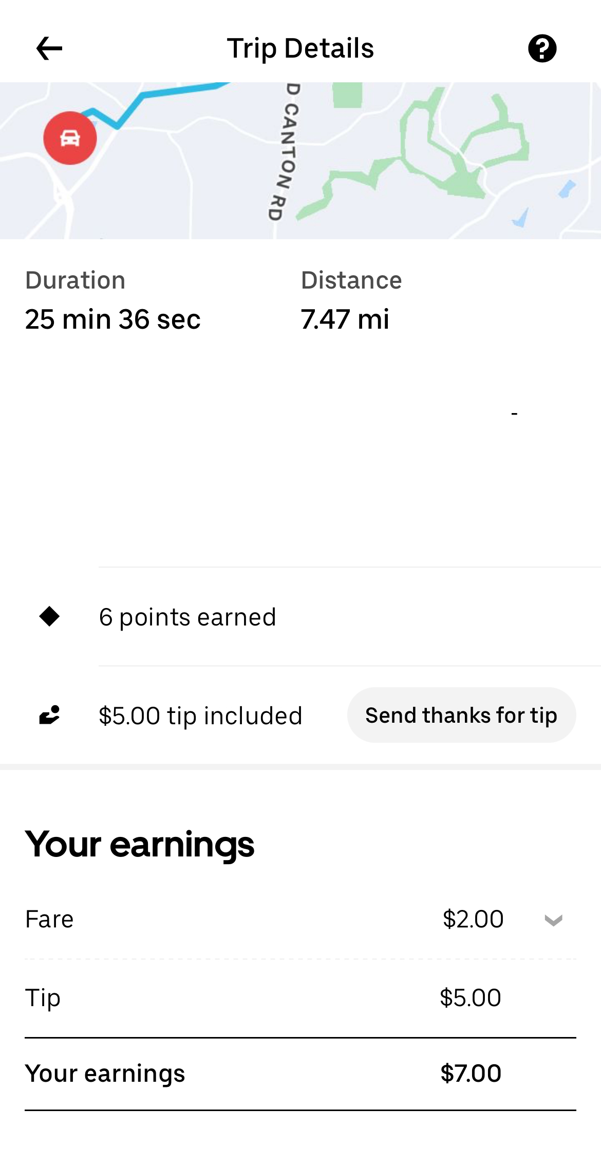
Now, I wasn’t naive—I’d heard people say Uber doesn’t pay drivers enough. But seeing it firsthand was a different story. A 7-mile trip that only paid a $2 base fare was a cruel joke when you’re counting every dollar. This past weekend, after 4.5 hours of driving, I’d made $36 in fares and $55 in tips. That ratio tells the whole story: my real income comes from tips, not Uber’s pay.
Here’s where it gets interesting. Traditionally, tipping comes after you’ve received service—your way of rewarding good work. But Uber flips the script. The app prompts you to tip upfront, during checkout.
The design uses preset options—10%, 15%, 20%—with little nudges of encouraging verbiage. The custom option is hidden at the bottom. And when you’re hungry, of course you’re just going to tap the quickest choice and move on.
On the driver’s side, every incoming fare shows a total amount with the included pre-tip. So instead of seeing “$2” for a 7-mile ride, I might see “$6.” It’s enough to make me accept the job instead of deleting the app altogether.
But here’s the kicker:
You only see how much you’ve accumulated once you pause taking new fares. And sometimes not all the tips are added yet.
You can’t see the real distance until after you accept and pick up the food—and declining too often gets you penalized.
Users can change their tips afterward, so that $6 offer could shrink back to $2 in the end.
I once accepted what looked like a decent $12 ride—then got stuck in Atlanta highway traffic on a Friday night. Burned through more in gas than the fare itself. The actual pay? $4. The rest was tips.
Uber’s payment model banks on one thing: enforcing tipping culture built on design nudges. Drivers are shown inflated totals to keep them hopeful and working, while the bulk of their “pay” is shouldered by users, not Uber.
This isn’t accidental. It’s choice architecture at work: preset options, encouraging nudges, hidden alternatives—all to guide your behavior. Is it still good UX design just because it works? Or is it dancing on the line of design and deception?
Driving deliveries didn’t just give me gas money (barely!) — but it also gave me a front-row seat to how design decisions ripple into people’s everyday lives. Uber’s tipping UX design doesn’t just change how people tap buttons; it changes how drivers survive.
And it left me asking: when we design for convenience, are we also designing for exploitation?